Looking for website design examples? Your inspiration journey starts here.
Creating a website can feel daunting, but it’s all about making the right choices.
The best websites are crafted with care to match your brand and impress your users. Don’t worry about starting from scratch — our drag-and-drop builder and CMS Hub make it easy.
In this article, I’ll share a few dozen of the best website designs I’ve ever seen to inspire yours. You can click the links below to jump to explore website designs.
I’ve also included a bonus section for designs that are just plain cool, so check them out, too!
Best Website Designs to Inspire You in 2024
- Hyer
- Mubasic
- Digital Cover
- IBM
- Superlist
- Swab the World
- Newest Americans
- Spotify Design
- Andy Warhol
- Human Interaction Company
- Garoa Skincare
- 1917: In the Trenches
- The Octopus
- Nomadic Tribe
- Diana Danieli
- George Nakashima Woodworkers
- Crypton.trading
- Overflow
- Frans Hals Museum
- Simply Chocolate
- NOWNESS
- Rainforest Guardians
- Protest Sportswear
- The Teacher’s Guild
- Virgin America
- ETQ
- Mikiya Kobayashi
- Guillaume Tomasi
- Tej Chauhan
- Amanda Martocchio Architecture
- Donaldson Clinic
- Pony Studio
- Lacoste Heritage
- Unseen Studio
- RCA Records
- Cyclemon
- Silencio
- Alexander McQuin
- Gapsy
- Leif
From familiar corporations to small businesses to international organizations, the following sites push the status quo on the web.
To help surface some of the most inspirational designs, I gathered several award-winners that have made their way through several key awards organizations — including Red Dot, Awwwards, UX Awards, The Webby Awards, SiteInspire, Best Website Gallery, and FWA.
Keep in mind that web designs are fluid and change often. Some of the designs in this list have changed since they were awarded, but we do our best to keep them up-to-date. I’m confident you’ll find a design here that sparks your creativity.
Read More: 77 Examples of Incredible Website Design
Download this free guide to see even more examples of website blog, homepage, and landing page designs.
Beautiful Award-Winning Websites
Best Website Designs from 2023
1. What Is Missing
Award: Activism Webby Winner, 2023
Websites are a powerful tool for storytelling, and What Is Missing showcases this with mastery. This website educates visitors about the Earth’s sixth mass extinction with losses of species habitats and more.
When I first arrived on the page, I saw floating white dots on a black background reminiscent of the stars. Text described the losses we’ve experienced from climate change.
The dots came together to show a circle where images of wildfires and plants growing appear. I was then invited to enter the site.
There, I saw a planet made up of dots. I could click on different categories to learn about various aspects of the natural world we’ve lost.
I read people’s memories, watched poetic videos about extinct species, and learned about habitats that have been destroyed. Soundscapes of animals and rushing wind provided a soundtrack.
However, the website isn’t all doom and gloom. There’s a section for solutions. The glob changes into a map with bubbles you can click to learn about how we can slow climate change.
What I like: Imagery and sound were used strategically to immerse me into the site.
2. Persepolis Reimagined
Award: Art & Design Webby Winner, People’s Voice Winner, 2023
An immersive experience created by Getty, Persepolis Reimagined allows you to explore the city during the reign of King Xerxes.
The site is powered by scroll, allowing you to explore the city and zoom in on different significant places within its walls.
When I visited the site, I was reminded of walking tours you might take on vacation. For example, I scrolled to see a rendering of the Gate of All Nations. As I continued to scroll in, I looked closer at the bulls bordering the gate.
I clicked to view what the ruins look like today.
I then chose to learn more about the bull iconography for the empire. I could scroll through a history lesson horizontally with even more Getty images.
What I like: The site feels like visiting a museum without spending a ticket or hopping on a plane.
3. The Health Inclusivity Index
Award: Best Data Visualization Webby Winner, 2023
This site from Economist Impact analyzes the health landscape of 40 countries worldwide. The bread and butter of the site is a ring made up of different lines. Each cluster of lines is a country, and each individual line is a piece of health data.
As I scrolled, I could select a country or view countries by a sorting metric, like health equity or GDP per capita. When I hovered over a country, I could see the countries’ scores and where they ranked on the list.
Further on the page, I see specific case studies related to COVID-19, access to healthcare, and the limits of high healthcare spending. There’s also a full news story that digs into the research.
As I scrolled, I saw different data representations of the information on the page. That includes where countries ranked on a scale and how income affected health.
What I like: Don’t have enough time to explore the full site? There is a carousel of critical insights you can explore as soon as the page loads.
4. RCA Records
Award: Best User Interface Webby Winner, 2023
RCA Records’ site stuns from the beginning. The page opens strongly above the fold. Editorial photos of artists greeted me. I noted recent favorites, like Doja Cat, and the label’s historic musicians, like Elvis and David Bowie.
The words art, records, and culture appear on screen. When I hovered over them with my circular cursor, the text distorted. I also had the option to click “make noise” so I could hear music throughout my experience.
The rest of the page makes use of animations. When I hovered over images, I could see information about recent singles. Marquee-style scrollers showed artist names and songs.
When I hovered over these bars, videos of the musicians performing appeared.
What I like: Movement across the site keeps the experience engaging and makes me want to explore further.
5. Design Threads
Award: Best Individual Editorial Feature Webby Winner, 2023
Design Threads is a superb example of a text-heavy site that wins in design. When you start the report, you are greeted with simple left-aligned text with the name of the project and a definition of the word thread.
The introduction section features dark text over a light background. Here, you can learn about design broadly and explore the report’s methodology.
Below that, there are subsections introduced with light text over a dark background. The titles of these sections make use of creative typography, which grabbed my attention.
I then learned about each trend with examples. The report features pictures of art, memes, and products for sale.
I then learned about each trend with examples. The report features pictures of art, memes, and products for sale.
What I like: I loved this animation of design books breaking apart as I scrolled.
6. Moooi Paper Play
Award: Best Visual Design — Aesthetic Webby Winner, 2023
Created by luxury furniture and lighting company Moooi, Paper Play showcases some of the company’s innovative products in an imaginary, digital room.
When the page loaded, I was presented with a beautifully designed room that shifted slightly as I moved my mouse. The soundtrack to the site featured ethereal tones paired with playful percussion.
I clicked on dots to learn more about the different items on display.
Some points of exploration were for products, like the PLIÉ PLISSÉ light that shifts as the ambient light of your room changes. Others were for general points of interest, like the cranes featured in the space.
What I like: The aesthetic of the site — luxurious and whimsical — matches the personality of the brand.
Best Website Designs from 2022
7. Hyer
Award: Website of the Month (2022), CSS Design Awards
Want to make a strong impression on your website visitors? Take a page out of Hyer’s book.
This striking illustration of the airplane, as it slowly moves across the screen, is sure to grab website visitors’ attention.
This page has everything you need in an effective homepage: An image that tells a story but isn’t too distracting, the use of white space, an easy nav bar, a tagline or slogan, and a clear call-to-action (CTA).
It’s a clean design that’s free of any distractions and invites visitors to learn more about the brand.
What I like: Smooth scrolling transitions, simple layout, and excellent copy — especially this part: “…in a world where passengers have become numbers, a personal approach is key.”
8. Mubasic
Award: Website of the Day, August 10, 2022, Awwwards
Mubasic’s site isn’t just visually compelling. It’s dynamic. Mubasic is a catalog of high-quality music for children, and the website’s design decisions help it achieve a light-hearted, easy-going feel.
The poppy color scheme and effective visual hierarchy contribute to this site’s design success. However, the real reason it shines is because of how the design feels authentic to the brand’s mission.
The homepage easily allows you to explore the company’s offerings and even features a Q&A section set up in a unique format. Images pop up as you scroll down the page.
Toward the bottom, there’s the opportunity to get in touch with contact information and a new customer form template.
When you reach the bottom of the homepage, there’s a menu that features anchors to allow you to jump to wherever the information you’re seeking lives on the page.
What I like: The color palette and the brand’s “less is more” approach make the site so simple and fun at the same time.
9. Digital Cover
Award: Website of the Day, July 31, 2022, Awwwards
Everything from the loading screen to the homepage of this France-based digital agency’s website is a visual homerun. When you arrive on this homepage, you’re immediately swept into the world of Digital Cover.
This is achieved by a graphic that appears nearly three-dimensional, popping up and welcoming you into the company’s orbit.
Similar to the previous site, the animated nature of Digital Cover’s homepage adds intrigue and establishes this site as a candidate for best website design.
With a simple swipe of a mouse pad, you’re led to the company’s projects, or you can navigate to the clearly labeled menu in the top left corner. When you do, several options pop up.
From there, you are escorted to the page of your selection. The white lettering against the black background allows for the copy to pop.
If you scroll to the bottom of any menu page, you’ll find contact information to get in touch with the agency, which is another strength of the design.
What I like: The dark and mysterious vibe with the surprise element. It’s super cool how products seem to come towards me with 3D motion.
Best Website Designs from 2021
10. Superlist
Award: Site of the Month (April 2021), Awwwards
Superlist is a productivity app that helps teams and individuals change the way they work.
Too often, you land on a website and have to figure out what the brand is about. With Superlist, you know exactly what to expect as soon as you get to the homepage.
The interactive homepage has an on-point copy, showing what the site is all about. There are three easy-to-notice buttons that clearly show how the app supports teamwork, personal tasks, and everything in between.
Superlist effectively uses white space to keep the focus on its copy. When you scroll down, you can see interesting motion transitions. The fun visuals continue until the end of the site, keeping us engaged all the time.
What I like: Playful transitions and a big CTA button which changes colors when you hover over it with the mouse.
Best Website Designs from 2020
11. Swab the World
Award: Site of the Day (2020), Awwwards
Parallax, bold colors, and negative space shape the design and experience of Swab the World’s website. The organization brings awareness to stem cell donations.
Their mission is to “Make sure every single patient finds their match. Period.” Photos of couples exhibiting love and emotions bring a human element to a historically complex and scientific process.
From a technical perspective, the design makes moving down the page feel natural, ensuring the readers reach each point of copy and every CTA on the homepage.
What I like: How the color changes show that everyone, no matter their race, deserves to be healthy and needs to have the same rights.
12. Newest Americans
Award: Honorable Mention (2020), Awwwards
An organization with a responsibility as large as honoring past, present, and future migrating identities needs a beautiful and functional website to help spread the word.
Newest Americans champion immigrant experiences in cities across the state of New Jersey.
The website uses beautiful imagery of people, places, and items that represent this experience in a way that flows cohesively down the homepage, telling the story of this group of America’s newest citizens.
The website is both visually appealing and functional, with a simple navigation menu, stories organized by photos, and a clean press page that puts the most recent articles front and center.
What I like: The slow-motion video in the background and full-screen images with titles leading to articles.
13. Spotify Design
Award: Honorable Mention (2020), Awwwards
Spotify is known for its fair share of amazing feats, and its latest iteration of Spotify Design is no different.
Serving as the hub for all things visual and creative for Spotify, the music and podcast streaming giant gives listeners a look into the who, what, why, and how of what makes the app so sensational.
Bright colors, drop shadows, and smooth animations give this website character and depth. The flat geometric designs with abstract accents make albums and artists practically jump off of the screen.
Looking for more design inspiration from microsites like this one? Read our post of the Best Microsite Examples We’ve Ever Seen.
What I like: Animations, illustrations, color scheme, and automatic sliding feature that switches between articles.
14. Andy Warhol
Award: Honorable Mention (2020), Awwwards
Artist, film director, and producer Andy Warhol’s life is encapsulated in this splendidly designed website that captures his art style in a digital format.
As you peruse the page, your cursor becomes a spotlight that converts every image you hover over into a negative image or inverses the colors of the text you’re reading.
The big, bold text makes a statement and emphasizes just how important copy is to website design. Subtle animations help pace the site and set the tone for each section as you peruse the homepage.
What I like: Horizontal scrolling, artistic colors, and storytelling vibe.
15. Human Interaction Company
Award: Corporate Website (2020), Red Dot
To see the video done right, look no further than the Human Interaction Company. From the moment you click on the site, the experience is lightning-fast.
You’re dropped directly into the action — the why, what, and how of Human Interaction and exactly what the team does.
This Red Dot Design Award winner aims to bring the study of human interaction to the masses and, in the process, show us just how engaging it can be to learn about it.
Don’t get discouraged by their award status, though — none of the photos on this site are photoshopped, so it’s a practical example of building quality with the resources you have available.
What I like: The changing background videos with colorful scenes, zooming images, and smooth transitions.
16. Garoa Skincare
Award: Site of the Day (2020), Awwwards
How do you transform the feeling of luxury and practicality into a website? Garoa Skincare provides a blueprint.
Whether your product costs half the price of your closest competitor or twice the price, your site can bring a sense of extravagance to just about any product you sell.
High-quality visuals, typefaces that complement each other, and a balance of negative space with useful copy can bring a simple elegance to your website.
What I like: The earthy colors, fresh and clean appearance, and the font choice. I love the layout as well!
Best Website Designs from 2019
17. 1917: In the Trenches
Award: Awwwards’ Best Website of the Day (2019)
This website, made to promote the film 1917, lets you walk around the trenches and perform the same mission that the characters did in the film. You can also see their maps or access other tools.
This is a great example of a site that went above and beyond with interactivity as well as a site that leverages its content and prewritten storyline to market its film.
This website won Site of the Day by Awwwards, which allows designers to vote and nominate great websites they see daily.
What I like: The homepage, especially frame 17 with the burning sky and ash scene, is so captivating. The 3D movement around the site is fantastic, too. Honestly, I’ve never seen a better film promotion.
18. The Octopus: A design blog by IDEO
Award: Business Blog/Website 2019 Webby award
IDEO, a global design company, won the Business Blog/Website 2019 Webby award for its Octopus blog, and for good reason.
Overall, the whole IDEO site is fantastic.
A few seconds after you enter the homepage, catchy yellow and pink letters will overlay the black-and-white text and add a pop of color.
If you hover over a blog post, the title is highlighted in yellow. If you hover over an image, the image is pulled towards you — two small features that make a big difference in terms of creating a unique and engaging user experience.
What I like: The text animation at the top of the website and the feature that highlights the blog posts’ titles.
19. Nomadic Tribe
Award: Awwwards’ Site of the Year nomination (2019)
This site, which was nominated for Awwwards’ Site of the Year, is one of the most engaging sites I’ve seen.
The homepage immediately begins playing a stunning video featuring a man walking across a desert, followed by gorgeous landscape scenes and text like, “Are you lucky enough to call yourself an adventurer?”
The text throughout the website is playful, with colorful pinks and oranges and yellows, and the homepage is logically designed, with CTAs placed throughout that range in commitment level from “Read More” to “Watch Now” and, finally, “Download the App.”
Ultimately, the website is beautifully designed with strong attention to detail and tells a compelling story throughout.
What I like: The scenes of desserts and safaris on the homepage, the storytelling vibe, and the “Featured Nomadi” section. I also love the symbolic icons in the navigation bar.
20. Diana Danieli
Award: Webby 2019
This 2019 Webby-winning site shows off imagery of art and architecture with either high contrast or heavy exposure. As a website visitor, you can click and drag your mouse to change the photos and variations.
Each image shows a piece of work that highlights the artist who owns the website.
A cool plus about this website is its incorporation of audio and music. Click certain buttons on the screen to play piano notes and be truly immersed in the Diana Danieli experience.
Want to see more personal websites? Check out our post on the Best Personal Websites.
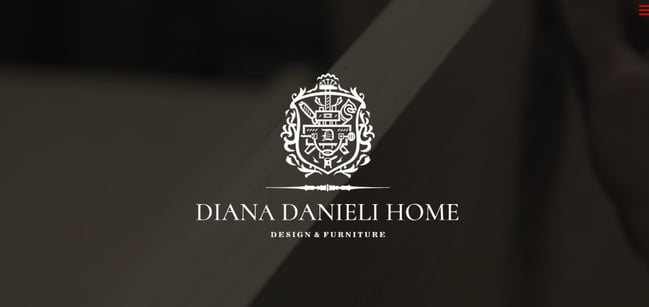
What I like: The dark background with production videos and the focus on using wood for furniture. I love the simplicity, minimalism, and black-and-white theme.
21. George Nakashima Woodworkers
Award: Webby 2019
This woodworking website emphasizes nature and care for the woodworking trade. It’s essentially a slideshow of beautiful forestry and farming images.
As a new image comes on the screen, a new quote related to wood or trees also appears.
This is incredibly relaxing to the visitor and shows that the woodworkers recognize the beauty of trees and the environment. This website also won a Webby in 2019.
What I like: The earthy color palette, clear layout, quotes about wood, and beautiful nature pictures.
Best Website Designs from 2018
22. Crypton.trading
Award: Site of the Day (4/3/2018), Awwwards
Meet crypton.trading, your robot accountant.
Crypton.trading is a trading hub for cryptocurrencies such as Bitcoin, using artificial intelligence to predict changes in a currency’s value and identify key buying and selling opportunities.
The website was rated high for its development and design, as it gradually explains more of the developer’s methods the further down visitors scroll.
This website makes tech-savvy visitors feel right at home the moment Crypton’s greeting appears across the homepage, one letter at a time.
What I like: The interactive graph that changes as you scroll, displaying features like “sell” and “gain.”
23. Overflow
Award: Site of the Day (3/20/2018), Best Website Gallery
Overflow is a design tool that allows people and businesses to create story-like flow diagrams of their ideas so they’re easier for others to understand.
Aside from this being just a good service, the Overflow website practices what it preaches — the website promotes its product using a flow diagram.
The website delivers this flow diagram in the form of a video.
While embedded videos can look clunky sitting in the middle of a website’s other design elements, Overflow’s is perfectly placed and exactly what you’d want to see when landing on the site for the first time.
Check out our SaaS web design post for more inspiration.
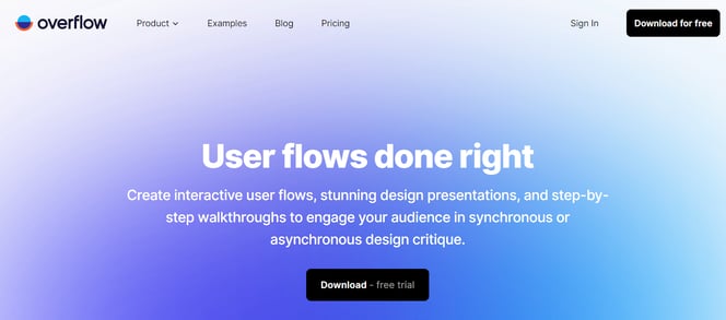
What I like: The design feels fresh and modern. But what really grabs my attention are the motioned flow diagram and those short product “presentations.”
24. Frans Hals Museum
Award: Site of the Year (2018), Awwwards
It can be tough for a museum to present all of its artwork together on a cohesive website. That’s what makes the website of the Frans Hals Museum so impressive.
Located in the Netherlands, this museum has created a website that uses a combination of digital design elements and its own exhibits.
This mixture helps visitors understand what they’ll see, when they can see it, and where else they can get a taste of what this museum has to offer.
What I like: The blend of history and modern elements. I also like the huge letters, bright colors, and interactive transitions.
Best Website Designs from 2017
25. Simply Chocolate
Award: Site of the Year (2017), Awwwards
You’ll get a craving for chocolate just looking at this website — and in a way, that’s Simply Chocolate’s website working as designed.
This appetizing website is that of Denmark chocolate maker Simply Chocolate. Its website uses a variety of colors (and creative product names) to promote each chocolate bar.
And as you scroll from one product to the next, they all seem to remain consistent in brand.
The vibrant yellow package and yummy chocolates in the bowl make you feel like you can grab it off of your computer screen, while the “Order Now” CTA to the top-left is ideally placed for users to select the products they want while browsing.
What I like: Sleek design, simple layout and mouth-watering images. One of my favorite parts is the video showing how they make chocolate.
26. NOWNESS
Award: Best Cultural Blog/Website, 2017 Webby Awards
NOWNESS is perhaps the coolest crowdsourced video blog on the internet. That was a mouthful. What does it all mean?
NOWNESS’ crowdsourcing is part of what makes it an award-winner. This means most of its content comes from independent creatives — an increasingly popular way for businesses to publish content.
NOWNESS is also a video channel, meaning all of its blog content is in video format. Together, these qualities help make NOWNESS a captivating hub for the stories that brands everywhere strive to tell.
What I like: I fell in love with the presentation video in the center of the homepage. I also like the journal-style design and the simple black-and-white theme.
Other Cool Website Designs
27. Guillaume Tomasi
As a Photographer in Montreal, Guillaume Tomasi has built a portfolio that’s truly fit to house his unique and awe-inspiring photography.
His surreal photo style is juxtaposed by his simple, flat, empty, and minimalistic portfolio design that places all of the focus on the work itself.
His unique series navigation, coupled with art-gallery-inspired introductions and perfect scrolling interactions, yield an experience reminiscent of that of a real gallery
What I like: The mosaic layout with moving images. It feels like a big bubble is spinning, showing the picture inside.
28. Tej Chauhan
Tej Chauhan has turned impressionist artwork into a business model with this intriguing website.
Each image on this product developer’s homepage slides out to cover the previous image, offering little context around the object you now see in front of you. But it’s that lack of context that makes you want to learn more.
Plus, the tagline, “Souvenirs of The Near Future,” suggests these objects are a part of their product line — and an opportunity for you to bring these innovative objects into your life.
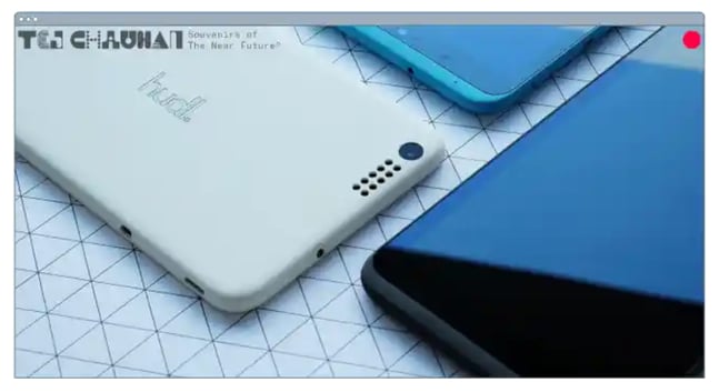
Want a similar look for your website? Check out the new CMS Hub theme collection on the Envato marketplace.
What I like: The swift transition between images of products/designs. I love the simplicity, which focuses on displaying the offer rather than excessive talking.
29. Amanda Martocchio Architecture
An architecture firm might not specialize in web development, but its website should still demonstrate its commitment to visually pleasing design. Amanda Martocchio took that to heart with this gorgeous website.
It’s no secret that Amanda Martocchio Architecture loves its work — each picture on the homepage of its website is an enchanting shot of the houses the company designs.
The website labels every house you scroll through with the type of design that was intended, along with numerous angles to each building.
What I like: The luxurious feel and photo-centric design.
Modern Website Design Examples
30. Donaldson Clinic
I love the fresh, minimalist design of Donaldson Clinic’s website. It’s sleek and modern and reflects the clinic’s professionalism and innovation.
Having an introduction to the doctors right on the homepage is a smart move — it quickly builds trust, which is especially important for sites of this nature.
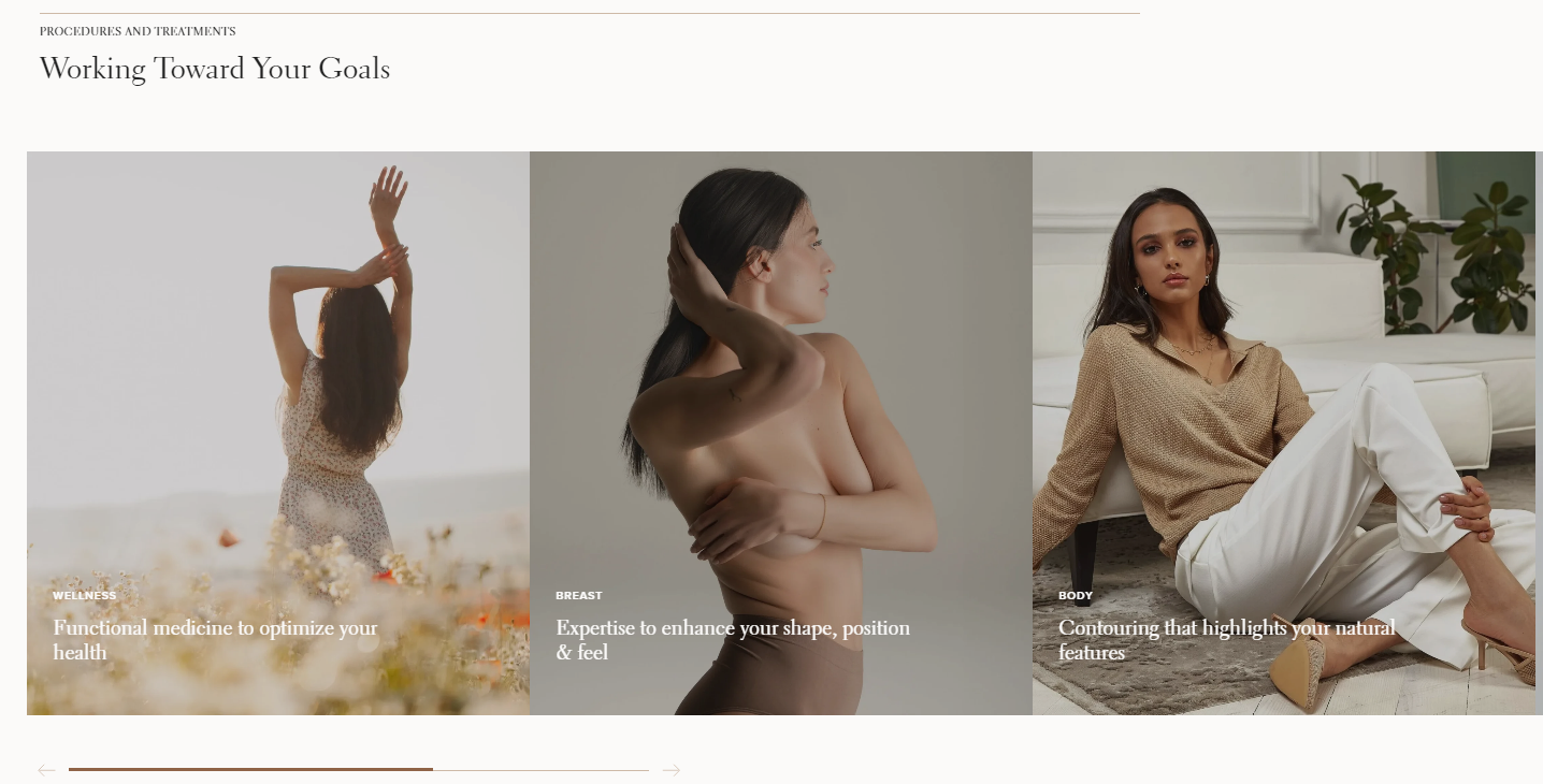
The high-quality imagery highlights the clinic’s facilities and makes it all look high-end.
With trust indicators and clear CTAs, it’s incredibly easy to feel confident and take the next step.
What I like: The “Procedures and treatments” section is definitely the biggest highlight. I love the aesthetic images that show Donaldson follows current trends.
31. Pony Studio
Pony Studio’s website is one of the coolest sites I’ve seen.
The mix of dark colors with bright pops is eye-catching, and I love the dynamic nature with motion, illustrations, and 3D elements.
As you scroll, you’ll see the super interesting case studies and integration of user feedback.
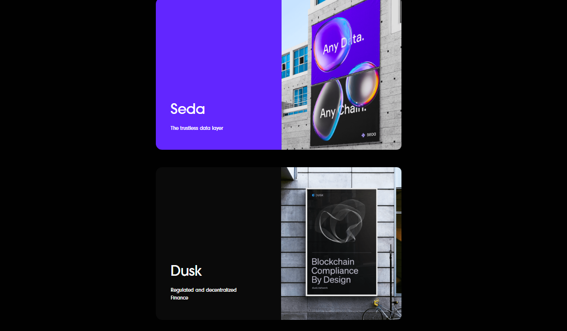
Every part of this site makes you want to explore more.
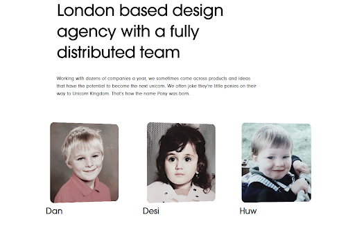
What I like: Probably the best part of the Pony site is how they showcase their team.
Boxes switch between current images and childhood photos of each member — it’s adorable, unique, and unlike anything I’ve seen before. Plus, instead of full names, they only use names or nicknames below each picture.
32. Lacoste Heritage
To celebrate Lacoste’s 90th anniversary, the brand collaborated with Bonhomme to showcase its story.
In April 2023, Awwwards recognized Lacoste Heritage, awarding it Site of the Day (SOTD) and DEVAWARD recognitions. The site excels in usability and overall design.
It displays Lacoste’s popular products through fantastic background video and image choices.
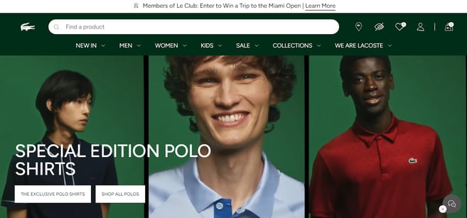
As you scroll, you’ll notice a charming feature: a small Lacoste crocodile that turns over and follows the mouse cursor — so original!
What I like: The site has great categorization, relevant links, and concise text, guiding you through the brand’s narrative and products.
33. Unseen Studio
Unseen Studio is a creative studio crafting unique ideas and visuals to help brands stand out. In my opinion, it has one of the most beautiful sites ever.
Awwwards proves my point by naming it the Site of the Month (SOTM) for February 2023.
First, a page opens with semi-open eyes representing “Unseen.”
Then, you can choose to enter the site by pressing the button. It’s also possible to turn off the music in advance if it bothers you.
When you enter the main homepage, it has a faded pink color prevailing. Everything is 3D and looks like a dreamland.
Moving the cursor across the page makes everything move and come alive.
The best part is when you hover over water — it creates ripples.
I don’t typically enjoy a ton of motion and background sound, but this site is so calming.
What I like: There are just three categories on the site — one leading to projects, the second to the index, and the third to the contact form.
34. ETQ
ETQ takes a minimalist approach to ecommerce. Big, compelling visuals of their product lay against simple, flat backgrounds accompanied by strong typography that keeps the focus on exactly what the user came there to see: shoes.
Looking for more ecommerce website inspiration? Read our post of the Best Ecommerce Website Design Examples to Get Inspired.
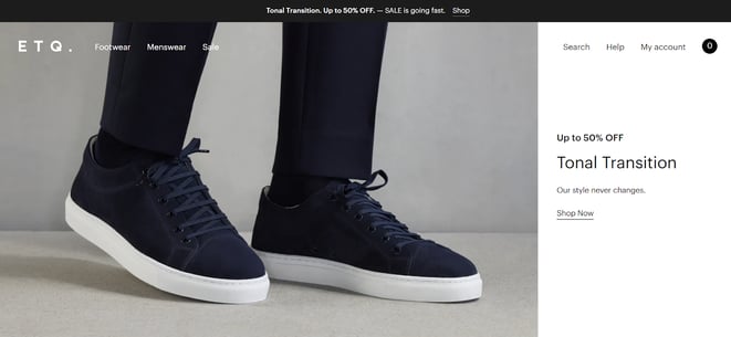
What I like: The website’s simplicity, muted color palette, and minimalist product presentation.
35. Cyclemon
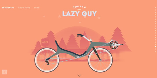
Cyclemon’s website is like a colorful picture book that you’ll love flipping through!
There’s a vertical side menu on the right to guide you where you want to go.
As you scroll, the pictures move smoothly, making it feel like you’re taking a fun ride.
These pictures are actually awesome posters they offer. There are so many cool things that I just had to keep scrolling to see them all.
For instance, check out this one:
What I like: Overall, I have just two words for this website: less is more.
Everything’s perfectly illustrated, with just three categories to choose from. You can go to “Experiment,” aka the homepage, “Show more” to learn about the founders, or “Shop” to pick your poster. It’s that simple.
36. Silencio
I’ve never had such a fun experience on any site like I had on Silencio.
On the homepage, you first see packaged products moving in the background.
As you scroll, you follow products through various stages. They get scanned at each step with a store scanner sound and light. Even a receipt pops up in the right corner.
You keep scrolling until the last step at the bottom, when the products finally land in the cart.
I have to admit — I scrolled through the page several times just to enjoy the interactive process.
What I like: The interactive experience with the minimalist design creates a great visual and engaging website.
37. Alexander McQuin
What I like about the Alexander McQueen website is how it tells the story of the brand.
It shows where McQueen came from, his background in tailoring, and how he revolutionized fashion.
The coolest detail is definitely a tailor’s measuring tape.
What I like: The website is easy to navigate, and the design is minimalist and luxurious. It feels like a high-end fashion magazine, with a strong focus on images and minimal text.
38. Gapsy
Since I’m a big fan of 3D sites, I simply had to include Gapsy on the list.
The homepage features text that resembles street graffiti on a wall.
As you scroll, the page moves horizontally. You’ll get the impression of entering a gallery where you can view projects and case studies and learn more about the company and service.
What I like: The concept is brilliant and intuitive and makes exploring the website enjoyable. That’s what I love most — when a website sells an experience, not just an intrusive offer.
39. Leif
Let’s end our list with Leif, an ecommerce site that makes you want to spruce up your home the moment you land on it.
Everything feels fresh and clean here, dominated by white and beige tones.
I especially love the picture choice — they’re not typical boring images with a white background. Leif uses real-life snapshots and products in actual home settings.
You’ll also see handwritten CTAs and headings, giving the brand a cozy, personal touch.
What I like: Unlike most online stores, the navigation is on the side instead of at the top, so it makes it easier to find what you’re looking for.
Where to Get Your Design Inspiration
If you want some design inspo, the good news is that you can find it just about everywhere.
One of the best ways to get inspiration for design is through travel. When you visit new places, you’re forced to get out of your comfort zone and experience something foreign.
What makes design so interesting is that everyone sees it differently and so, there’s always more to discover.
Another way to get design inspiration IRL is through the media. Every day, we are inundated with visual content. We make decisions about what we like, what we don’t like, and continue on our day.
But what if you were more intentional about how you viewed those interactions? You could come out of it with valuable insights.
You also can’t forget to leverage design communities. From design conferences to Reddit forums, there are hundreds of groups out there that can offer inspiration as well as advice.
Now that we’ve covered some IRL design inspiration sources, let’s cover the digital ones.
Website Design Inspiration Sources
1. HubSpot’s Website Themes & Templates Marketplace
HubSpot’s Website Themes & Templates Marketplace (previously HubSpot Asset Marketplace) houses hundreds of website templates that you can sift through to get inspired for your own website.
The best part of the marketplace is that you can narrow down by industry and feature, allowing you to see the templates that are most relevant.
Once you find a template you like, you can view a live preview of the site to get a full experience, then download it if you decide to use it.
2. Dribble
Dribble is where designers go to get inspired and to share their work. The website has everything from animation and branding to illustration and mobile.
Once you navigate to the “Web Design” tab on the homepage, you can filter results by color scheme, editing software, timeframe, and tags.
Furthermore, if you find a designer whose work you like, you can save the design for future reference and follow their work to see other designs on their profile.
This is an incredible resource to use whether you’re starting from scratch or already have a solid plan in mind.
3. Bēhance
This is another digital platform full of creative inspiration to leverage ahead of your website design project.
One of the best features of this site is the ability to filter by location. This allows you to see how designers in different regions differ in technique and style.
This can be particularly helpful if you are designing a website for a foreign, unfamiliar market. You can gain interesting insights by evaluating the decisions made by Behance designers.
4. Pttrns
Want to focus on mobile web design? Pttrns is the place to go.
This subscription-based platform allows you to gain access to thousands of mobile design templates and get advice from top designers all over the world.
Additional features on this platform include:
- A favorites and collections folder to store your favorite designs.
- A studio to interact with other designers and get advice.
- A design guide to understand the strategy behind the designs.
Website Design Ideas
Now that you’ve seen a number of beautifully designed and award-winning platforms, keep these potential ideas in mind as you create your own.
Here are a few suggestions I have to help you create a site that could appear on our best website design inspiration list.
- Consider ways that you can make your website interactive, like the 1917 example.
- Make a website that emphasizes the mobile experience, even while it still has a good UX on desktops.
- Create a website that tells a story about your brand with photos, text, or video.
- If you can’t create a heavily interactive site, consider drawing in eyes with a site that presents a slideshow of your photos.
- Ensure your CTAs are easy to see and encourage visitors to continue exploring your site.
- Keep navigation clean. Ensure your visitors always know how to get back to the homepage.
- Integrate your social media sites via social embed buttons, so site visitors can easily follow you on your various social channels.
- Keep each of your web pages consistent in design — including font, colors, images, and messaging.
- Test your website’s usability with a heat map, which will show you which web pages your visitors are most likely to bounce.
- Include a live chat or chatbot to give visitors the option to engage with you directly on your website if they prefer live chat to phone calls. Live chat can automate functions for your sales and service reps and create a better communication experience for the customer.
- Get an SSL certificate to ensure your website is secure. SSL is part of Google’s search ranking algorithm, so an SSL certificate can help you rank higher in search.
Modern Website Design Tips
Modern times call for modern websites.
I’ve recently listened to a great episode of The Futur podcast with Vitaly Friedman, who shared his blueprint for modern website design.
Here are some of his best tips:
- Skip the guesswork. Conduct testing to validate your design decisions. Create tasks that mirror real-life situations and recruit a diverse group of at least 15 participants to give feedback.
- Keep your design clear for everyone. Be mindful that what seems obvious to one person might not be so clear to another. Make it all look clear, fresh, and easy to understand.
- Make sure everyone has a good experience. Pay attention to accessibility features for screen reader users and people with disabilities. Focus on color contrast, typography, font sizes, and tab target sizes.
- Feel the vibes. Understand users’ emotional responses and brand perception through qualitative methods like descriptive feedback.
- Embrace the quirks. Imperfections and human mistakes make the design interesting. Or, as Vitaly Friedman says, “Sometimes I can smell your GPT text. I want to see TYPOS.”
- Change is good. Be open to trying new things, making improvements, and bringing innovations.
- Stir up some emotions. Aim to surprise, delight, or even challenge your users to create memorable experiences.
- Add a sprinkle of humor. Injecting some fun into unexpected places like terms and conditions can make users feel right at home.
Watch the whole episode here:
[Video: Blueprint For Modern Web Design: Deep Dive w/ Vitaly Friedman]
Let me now show you a case study of the updated website, which implemented some of these tips.
Case study: Enhancing UX Design for Blenz Website
Forge & Smith revamped Blenz, a Canadian coffee chain website for better UX and engagement — the results were stunning.
These were the objectives:
- Make the site look better and easier to use.
- Get more people to become customers through the app.
- Improve the menu with new drinks and seasonal offers.
- Help franchisees with a login for files, updates, and forms.
- Get more people to find the site through search engines.
- Use WordPress for an easy-to-manage, mobile-friendly website.
And, these were the results:
- 22% increase in engaged sessions.
- 103% increase in page views.
What I like about this design:
The pastel colors and playful illustrations match the Blenz ambiance.
Some images have a neat little motion that makes me feel the aroma of freshly brewed coffee through the screen.
I also love the easy navigation with good button placement.
Moreover, I didn’t know that the app was available, but I quickly found it thanks to its great position on the site. There’s also a download option and a clear CTA.
The “+” icons in the bar are super handy, too. They show which categories have more content below and which will take you to another site directly.
Build a Beautiful Website for Your Business
Now that you’ve perused our best website design inspiration, it’s time to get started creating your own site. You’d be surprised how easy designing a site is once you have a look and feel in mind.
Once you’re ready to start coding or dragging and dropping, you’ll have a beautiful website that your visitors will enjoy.
Editor’s note: This post was originally published in January 2021 and has been updated for comprehensiveness.

